
Create Your First Data Visualization in Python
You already know how to read a small CSV into a list or a dictionary. That skill gets you data. It does not get you understanding. Stare at twelve monthly…

Key topics
A table of numbers hides its story. A chart tells it in one second.
You already know how to read a small CSV into a list or a dictionary. That skill gets you data. It does not get you understanding. Stare at twelve monthly values in a list and you will not instantly see whether things are climbing, flat, or quietly collapsing. Draw those same twelve values as a line, and the trend is visible before you finish blinking.
That gap between having data and seeing data is where Python data visualization starts. In this tutorial you will install one plotting library, draw your first chart, label it so it explains itself, build a chart from a real CSV file, and learn to say honestly what your chart does and does not show.
What a Chart Is Actually For
A chart is a question made visible. That is the whole job.
Before you write a single line of plotting code, name the question you are trying to answer. Almost every beginner chart answers one of three:
- Comparison: Which category is bigger? (bar chart)
- Trend over time: Is this going up, down, or flat? (line chart)
- Relationship: When one value rises, does the other rise too? (scatter plot)
Pick the question first, then pick the chart. This ordering prevents most beginner mistakes, because the wrong chart type can make honest data look dishonest. A line chart drawn through unordered categories invents a trend that does not exist. A bar chart with a y-axis that starts at 90 instead of 0 makes a 2% difference look like a cliff.
The same numbers, shaped differently, tell different stories. Your job is to pick the shape that matches the question — not the shape that looks most impressive.
Knowledge check
Check your understanding
Answer this question before you continue.
Install Matplotlib and Draw Your First Line
Matplotlib is the most widely used Python plotting library, and it is the right first tool because it gives you direct control over every element of a chart. Install it from your terminal:
pip install matplotlib
Confirm it landed:
python -c "import matplotlib; print(matplotlib.__version__)"
3.8.2
Your version number will differ. What matters is that no error appears.
Now the smallest possible chart. Create a file called first_chart.py:
import matplotlib.pyplot as plt

months = ["Jan", "Feb", "Mar", "Apr", "May", "Jun"]
signups = [12, 19, 15, 27, 34, 41]

plt.plot(months, signups)
plt.show()
Run it:
python first_chart.py
A window opens with a line climbing from left to right. That is your first chart.
Two things to notice. First, plt.plot() takes two lists of equal length: the x-values and the y-values. Second, plt.show() opens the window and blocks until you close it. If you run this from a terminal and nothing seems to happen, check whether a window is waiting behind your editor. That surprises almost everyone the first time.
Pick the Right Chart Type for Your Question
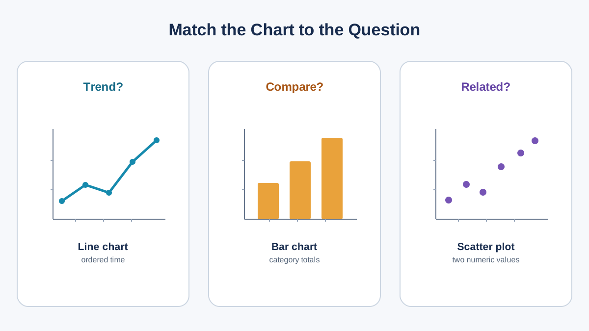
You have three chart types that cover nearly everything a beginner needs.
| Chart type | Question it answers | Data shape it expects | Use this when |
|---|---|---|---|
Line (plt.plot) | How does this change over time? | Ordered x-values, numeric y-values | Months, days, years, sequence |
Bar (plt.bar) | Which category is bigger? | Category names, numeric values | Products, teams, regions |
Scatter (plt.scatter) | Do these two values move together? | Two numeric columns, paired rows | Price vs. quantity, height vs. weight |
Two chart types to avoid as a first attempt:
Pie charts. They are hard to read when you have more than three or four slices, and humans are bad at comparing angles. If you want to compare parts of a whole, a bar chart usually wins.
3D charts. They look impressive and communicate less. Depth adds a dimension your reader has to mentally flatten, and it often hides the values you actually care about. Save 3D for when the third dimension is the point.
A good beginner instinct: if you cannot state your question in one sentence, you do not yet know which chart to draw.
Knowledge check
Check your understanding
Answer this question before you continue.
Label the Chart So It Explains Itself
Right now your chart is a line with no context. Hand it to someone else and they will ask what the axes mean. Fix that with three calls:
import matplotlib.pyplot as plt

months = ["Jan", "Feb", "Mar", "Apr", "May", "Jun"]
signups = [12, 19, 15, 27, 34, 41]

plt.figure(figsize=(8, 5))
plt.plot(months, signups, marker="o")
plt.title("Monthly Signups, First Half of Year")
plt.xlabel("Month")
plt.ylabel("New Signups")
plt.grid(True)
plt.show()
Compare the two versions. The first was a shape. This one is a statement: signups grew from 12 to 41 over six months, with a dip in March.
Three changes did the work:
plt.figure(figsize=(8, 5))sets the width and height in inches. Without it, labels get cramped on small figures.plt.title(),plt.xlabel(), andplt.ylabel()give the chart a voice.marker="o"puts a dot on each data point, so the reader can see exactly where the measurements are.
Add a grid or legend only when it removes ambiguity. A grid helps here because you are reading values off the y-axis. A legend is pointless with one line — there is nothing to disambiguate.
Tip: If you cannot describe your chart in one sentence using only its title and axis labels, the labels are not finished.
Build a Chart From a Real CSV File
Hardcoded lists are training wheels. Real data lives in files. You already know how to read CSV files with the csv module, so this step is mostly about one trap: CSV values arrive as strings.
Create a file called sales.csv:
month,revenue
Jan,4200
Feb,4800
Mar,4600
Apr,5300
May,6100
Jun,6800
Now read it and plot it:
import csv
import matplotlib.pyplot as plt

months = []
revenue = []

with open("sales.csv", newline="") as f:
    reader = csv.DictReader(f)
    for row in reader:
        months.append(row["month"])
        revenue.append(float(row["revenue"]))

plt.figure(figsize=(8, 5))
plt.plot(months, revenue, marker="o")
plt.title("Monthly Revenue, First Half of Year")
plt.xlabel("Month")
plt.ylabel("Revenue (USD)")
plt.grid(True)
plt.show()
Run it:
python sales_chart.py
You get a clean line chart of six months of revenue, climbing from 4,200 to 6,800.
The critical line is float(row["revenue"]). Without it, Matplotlib receives strings like "4200" and tries to plot them as categories. The result is a scrambled or flat-looking axis that has nothing to do with your data. Convert first, plot second.
Knowledge check
Check your understanding
Answer this question before you continue.
Common Beginner Mistakes and How to Fix Them
Most "Matplotlib is broken" moments are not Matplotlib problems. They are data or setup problems wearing a plotting costume.
Plotting strings instead of numbers. If your y-axis shows category labels instead of a numeric scale, you forgot float(). Convert every numeric column before plotting.
Forgetting plt.show(). The script finishes, no window appears, and it looks like nothing happened. Add plt.show() at the end.
Mismatched list lengths. plt.plot(x, y) requires both lists to be the same length. If you get a ValueError, print len(months) and len(revenue) before plotting. One of them is wrong.
A chart that looks wrong is usually a data problem. Before you blame the library, print the first five values of each list. If the numbers are wrong, the chart will be wrong — and no amount of styling will fix it.
Common mistake: Assuming the chart is lying when the data is. Inspect the values first. The library draws exactly what you give it.
Read Your Chart Honestly
A chart is an argument, and arguments can mislead — sometimes by accident.
Your line chart shows six months of revenue going up. It does not show:
- What happened before January. Maybe revenue was higher last year and this is a recovery, not growth.
- What happened after June. The line stops because the data stops, not because the trend does.
- Why the numbers moved. A price change, a new customer, and a seasonal shift all produce the same line.
Axis scaling is the quietest lie. If your y-axis starts at 4,000 instead of 0, a 60% rise looks like a vertical wall. If it starts at 0, the same rise looks like a gentle slope. Neither is wrong — but you should know which one you drew.
And in a scatter plot, two values moving together is correlation, not cause. Ice cream sales and drowning deaths rise together in summer. Ice cream does not cause drowning. A third factor — warm weather — drives both.
Note: Write two sentences after every chart. One describes what it shows. One describes what it cannot tell you. That habit will make you a better analyst than most people who have been plotting for years.
Knowledge check
Check your understanding
Answer this question before you continue.
Practice: Chart Your Own Data
Time to run this on your own numbers.
Task: Take a small CSV you already have, or make one with five to ten rows. Plot it.
Requirements:
- Choose the chart type based on your question, not on what looks nice.
- Add a title and both axis labels.
- Write the two-sentence interpretation: what it shows, what it cannot tell you.
Stretch goal: Change figsize and turn the grid on. Then decide — did the chart get clearer, or just busier? There is no single right answer, but you should be able to defend your choice.
Once you can read a file, clean the values, and chart the result, you have the three pieces of a small reporting script. That is the next step: combining file reading, sorting or filtering, and charting into one script that runs on demand and produces a picture you can send to someone else.
Name the question. Pick the chart. Label it. Then say what it shows — and what it does not.
Knowledge check
Final check
Finish the article by checking the ideas you just learned.
References
Want a more structured Python path?
Use the Python Starter Pack to turn scattered tutorials into a focused practice path.
Python for Artificial Intelligence Starter Pack
Build a Python foundation you can actually use. The Python for AI Starter Pack brings together a guided path through setup, core programming concepts, data structures, files, JSON, APIs, debugging, and practical projects—so you can move quickly from running your first program to understanding and building useful software.
- 264-page illustrated PDF
- 12 guided Python chapters
- Visual concept diagrams
- Self-assessment quizzes
- Bonus deep-dive sections
- Files, JSON, APIs, debugging & projects
- Foundation for data, automation & AI
Coming soon


